

Problems:
Goals:
industry
Automotive & Mobility
SERVICES
Product design
iOS Design
Web Design
Skills
User Expirience
Design System
Interaction Design
User Research
Wireframing
Responsive
Prototyping
Visual Desing
Web Design
User flow
Step 1
To create this user persona, we conducted a combination of qualitative interviews and online surveys with frequent car renters, traditional rental companies, and ride-sharing services. Participants, including professionals who travel regularly for work and leisure, were asked about their experiences, frustrations, and needs regarding car rentals. Key insights came from understanding pain points related to hidden fees, taxes, and unclear rental terms, which led to developing a persona that accurately reflects the concerns of individuals like James. Additionally, we analyzed customer reviews and complaints from popular rental platforms to further validate the identified issues and inform the development of this persona.

Name
Age
Occupation
Income
Background
Goals
Frustrations (Pain Points)

1/3
Strengths
Weaknesses

2/3
Strengths
Weaknesses

3/3
Strengths
Weaknesses
Step 2
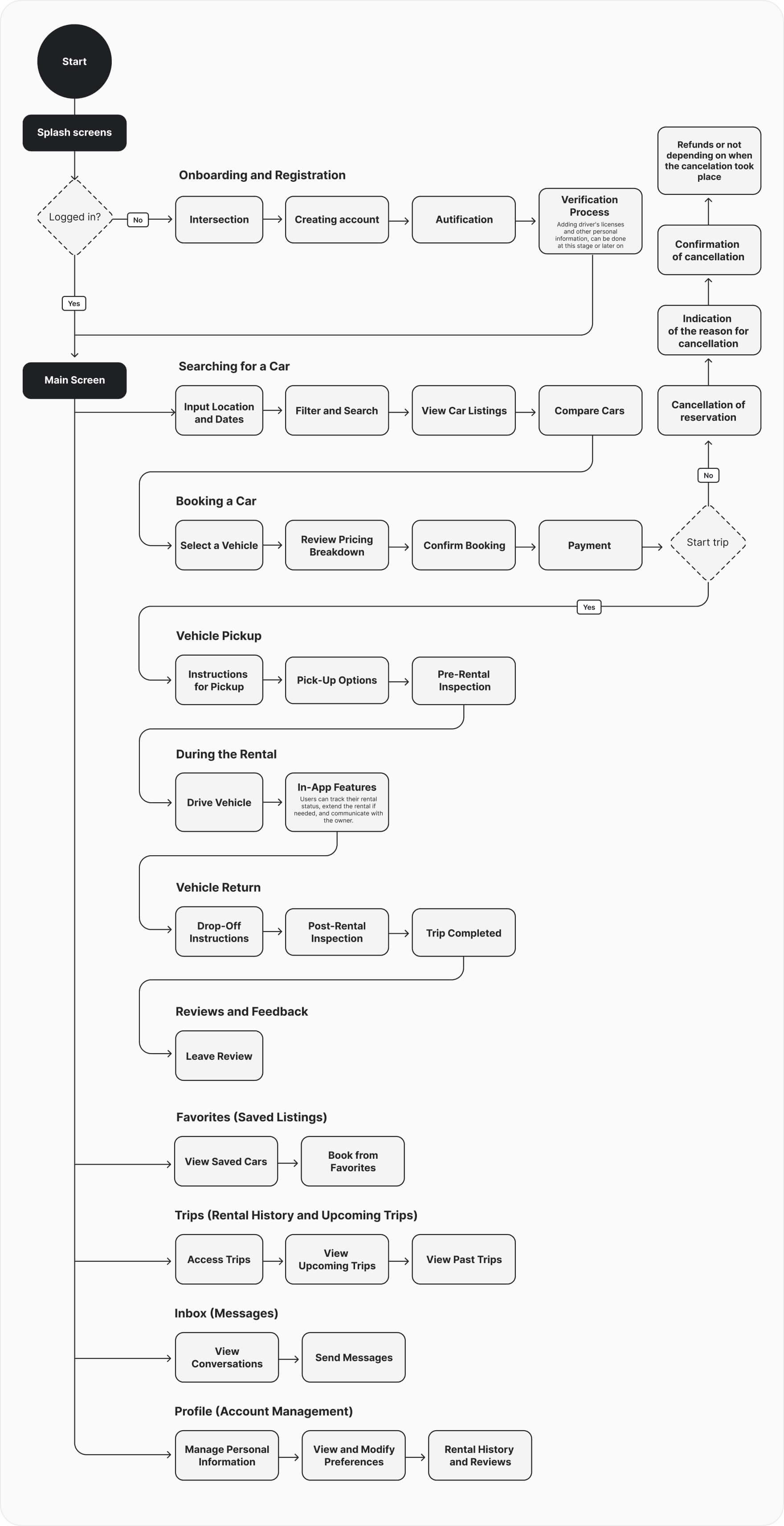
This user flow outlines the step-by-step process from the initial splash screen through onboarding, registration, and verification, leading to the completion of a car rental. The goal is to create a smooth and user-friendly experience, ensuring that each step is intuitive and efficient, minimizing friction for new and returning users.
Step 3
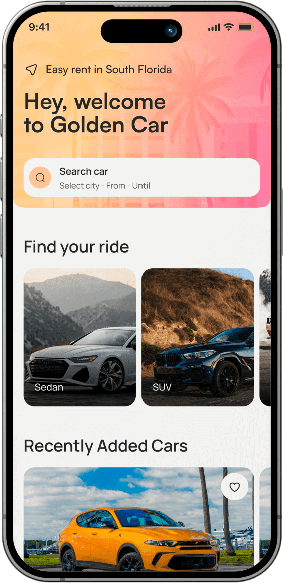
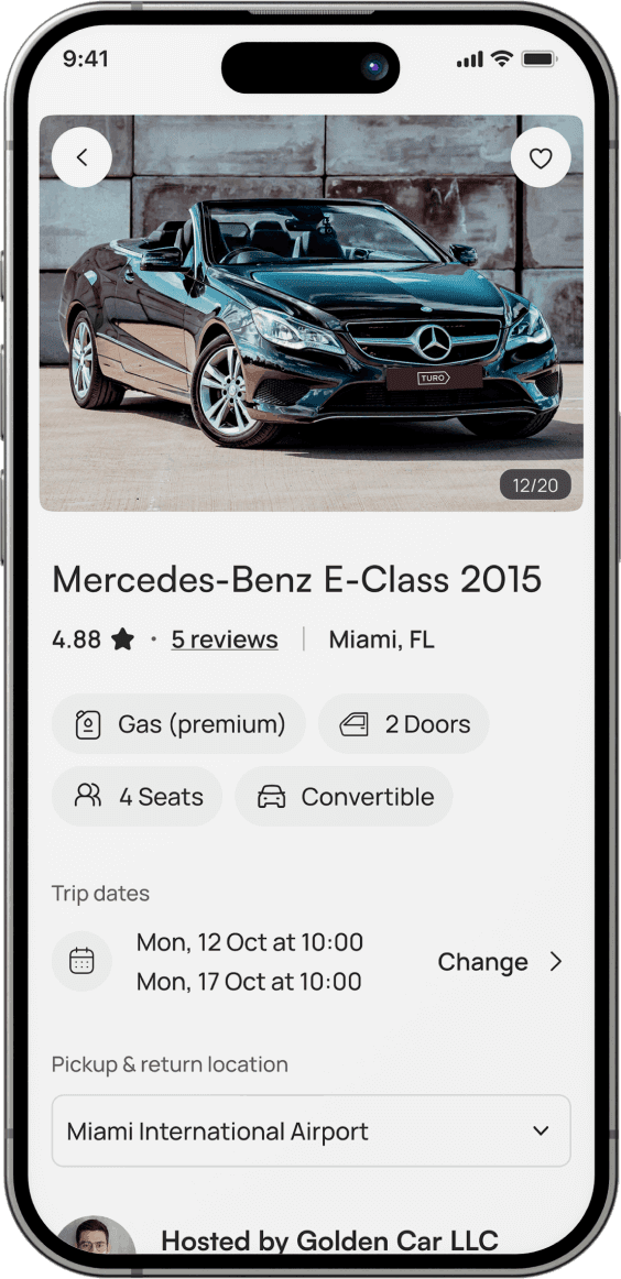
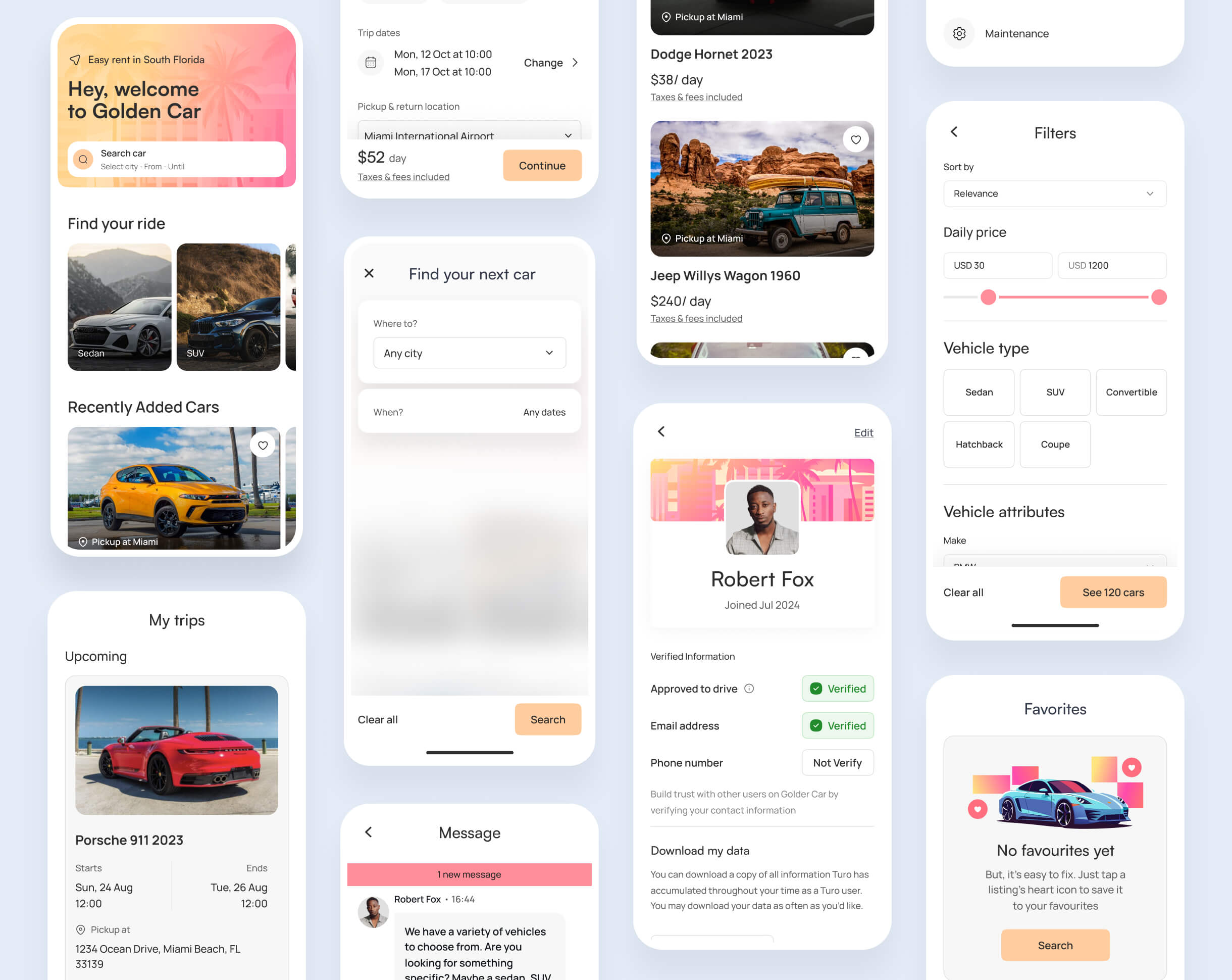
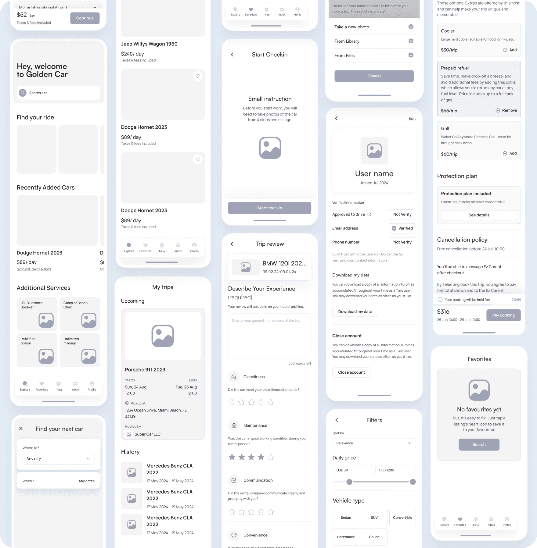
The low fidelity wireframes for the mobile application highlight the key screens and user interactions within the car rental platform. These wireframes focus on the core functionalities, including browsing available vehicles, managing bookings, and completing the check-in process. The design ensures that all essential information is easily accessible, providing a clear and intuitive experience for users as they navigate through the app.

Step 4
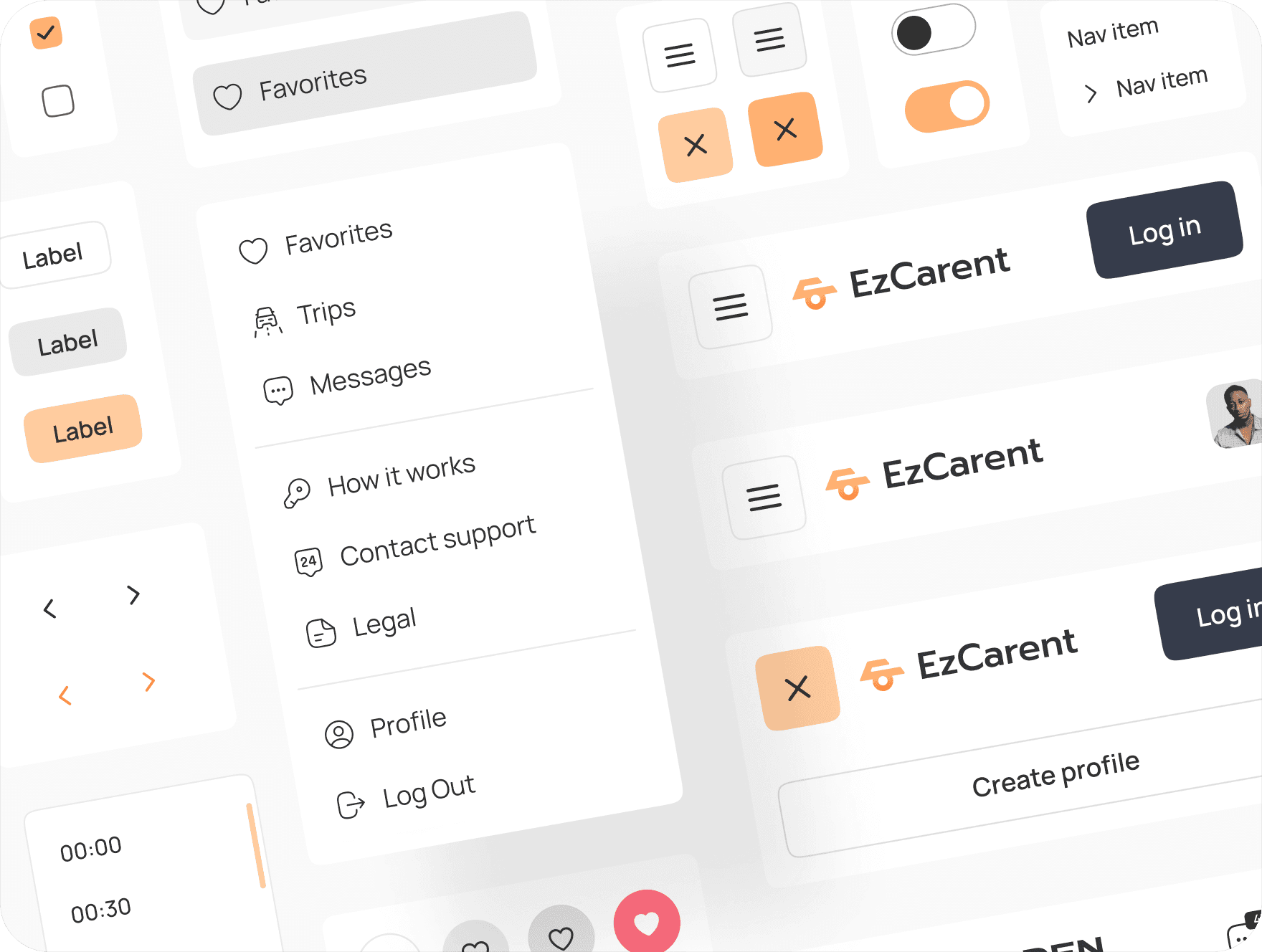
The design system establishes the visual and functional framework for the entire car rental platform. It includes a consistent set of UI components, typography, color palettes, and iconography, ensuring a cohesive and intuitive user experience across the web and mobile applications. The system promotes efficiency in design and development, allowing for rapid prototyping and scaling while maintaining brand consistency.
Step 5
We crafted over 80 screens for the mobile and web versions of the platform, ensuring a polished and cohesive user experience. These screens are optimized for usability and aesthetic appeal, providing a seamless journey from browsing cars to completing a rental.
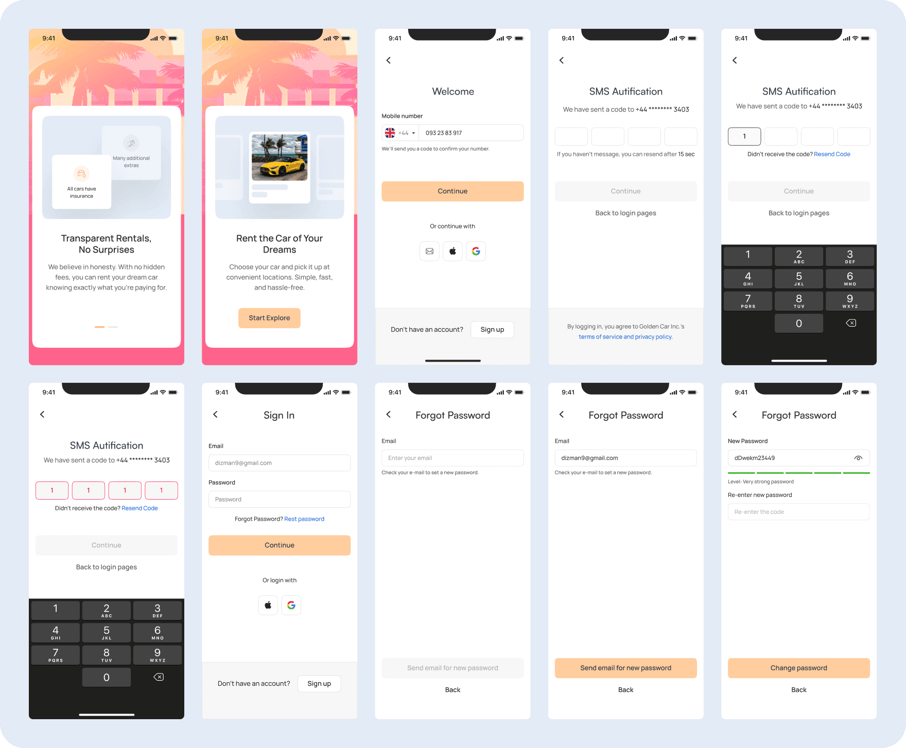
The onboarding process was designed to ensure a smooth and intuitive entry for users into the platform. It includes key steps such as signing up, SMS authentication, and password recovery, all crafted to provide a seamless experience. With a focus on user-friendly design and clear instructions, the onboarding flow helps users quickly and efficiently get started, rent cars, and manage their profiles, while ensuring secure and transparent interactions.
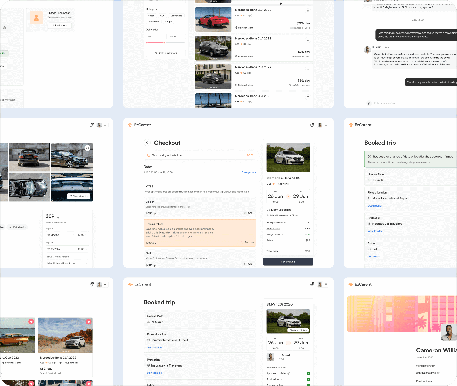
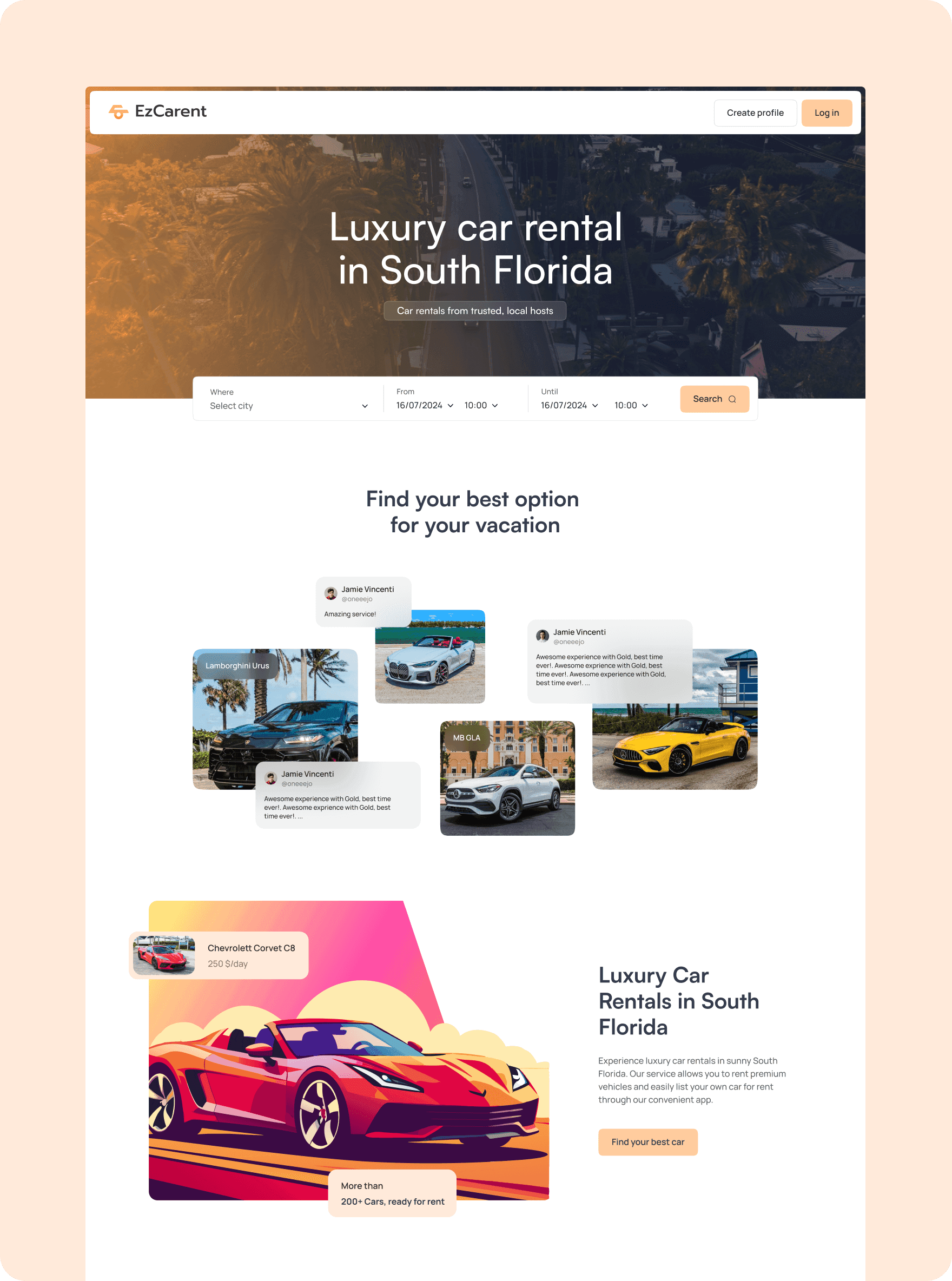
The car search process is designed to be flexible and user-friendly, allowing users to easily find their desired vehicle. Users can filter their search by location, date, and time, ensuring they get the most relevant results. The system also provides clear options for additional services and features detailed car listings, including pricing and availability. Whether searching for a short-term rental or an extended trip, this process ensures that users can quickly locate and book the perfect vehicle for their needs.

The design is optimized for a larger screen, providing a clear and intuitive user experience while maintaining consistency with the mobile version. Users can easily access their trip details, chat with support, and handle any modifications to their bookings with ease.
The visual style of the platform reflects a modern, sleek aesthetic, incorporating a warm and welcoming color palette with shades of orange, peach, and deep blue to evoke a sense of trust and professionalism. The chosen font, Satoshi, balances readability and style, with regular, medium, and semi-bold weights used throughout the platform. The brand’s identity is further enhanced by the use of custom illustrations and clean, minimalistic icons, creating a visually engaging yet functional interface that aligns with the overall user experience.

Step 6
We worked at a rapid pace, successfully designing the entire platform in just two months. Every morning, we held meetings with developers and managers to ensure alignment and address any dependencies. This close collaboration with the development team allowed us to quickly iterate and deliver a large number of screens for the desktop, responsive, and mobile applications. The team's ability to adapt and communicate efficiently was key to our success, ensuring the platform met all functional and design requirements within the tight timeline.


